Canonical
on 1 May 2013
Thank you for all your positive feedback after our first blog post.
We are very excited and are continuing with the designs,
here’s a quick update on how we’re getting on.
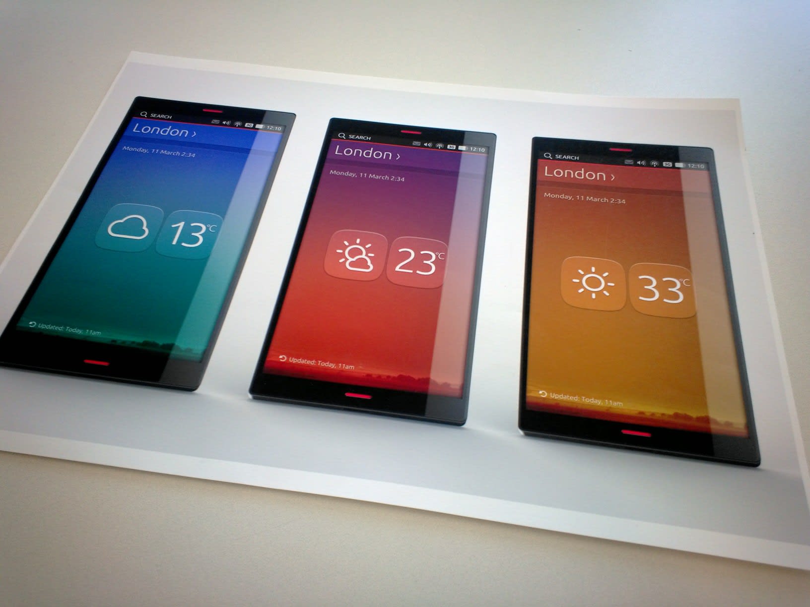
During the last few weeks we have been looking at the development of the weather and clock apps. We are also looking at set of gradients that could specify a range of weather conditions.
Here’s the how
A linear colour gradient is specified by two points, and a colour at each point. The colours along the line through those points are calculated using linear interpolation, then extended perpendicular to that line.
* wikipedia.org
This is great way to describe temperature and how it changes over 24 hours.
The second part of developing these apps was to create a set of graphic assets that could support the weather icons as well as the clock face.
Using entirely white mono assets was obvious to contrast with the colourful changing backgrounds.
But we quickly realized that the graphic style of our icons used as indicators or toolbar actions did not fit well for those assets. The weather icons, for example, looked a bit too heavy while we wanted something more zen and simple to blend nicely with the minimalistic and elegant design of the apps.
We replaced the solid fills with thin outlines and add some roundness to the end of the strokes. The weather icons have become playful but graceful, while keeping their plain but not to simplistic in the look and feel.
The clock faces are designed following to the same principles. With great results?
You be the judge 😉


