Rae Shambrook
on 17 August 2016
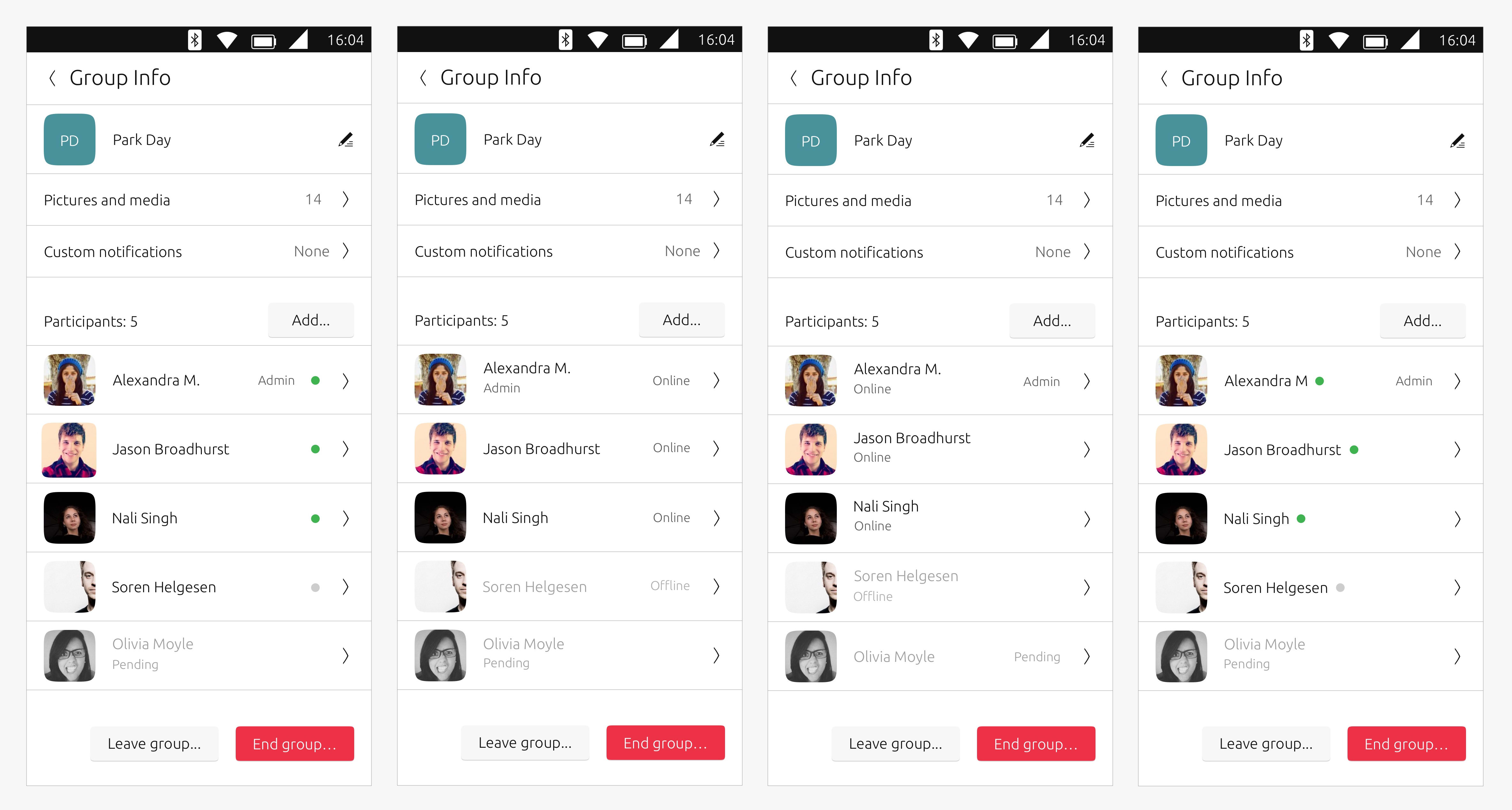
Recently I have been working on the visual design for RCS (which stands for rich communications service) group chat. While working on the “Group Info” screen, we found ourselves wondering what the best way to display an online/offline status. Some of us thought text would be more explicit but others thought it adds more noise to the screen. We decided that we needed some real data in order to make the best decision.
Usually our user testing is done by a designated Researcher but usually their plates are full and projects bigger, so I decided to make my first foray into user testing. I got some tips from designers who had more experience with user testing on our cloud team; Maria Vrachni, Carla Berkers and Luca Paulina.
I then set about finding my user testing group. I chose 5 people to start with because you can uncover up to 80% of usability issues from speaking to 5 people. I tried to recruit a range of people to test with and they were:
- Billy: software engineer, very tech savvy and tech enthusiast.
- Magda: Our former PM and very familiar with our product and designs.
- Stefanie: Our Office Manager who knows our products but not so familiar with our designs.
- Rodney: Our IS Associate who is tech savvy but not familiar with our design work
- Ben: A copyeditor who has no background in tech or design and a light phone user.
The tool I decided to use was Invision. It has a lot of good features and I already had some experience creating lightweight prototypes with it. I made four minimal prototypes where the group info screen had a mixture of dots vs text to represent online status and variations on placement. I then put these on my phone so my test subjects could interact with it and feel like they were looking at a full fledged app and have the same expectations.

During testing, I made sure not to ask my subjects any leading questions. I only asked them very broad questions like “Do you see everything you expect to on this page?” “Is anything unclear?” etc. When testing, it’s important not to lead the test subjects so they can be as objective as possible. Keeping this in mind, it was interesting to to see what the testers noticed and brought up on their own and what patterns arise.
My findings were as follows:
Online status: Text or Green Dot
Unanimously they all preferred online status to be depicted with colour and 4 out of 5 preferred the green dot rather than text because of its scannability.
Online status placement:
This one was close but having the green dot next to the avatar had the edge, again because of its scannability. One tester preferred the dot next to the arrow and another didn’t have a preference on placement.
Pending status:
What was also interesting is that three out of the four thought “pending” had the wrong placement. They felt it should have the same placement as online and offline status.
Overall, it was very interesting to collect real data to support our work and looking forward to the next time which will hopefully be bigger in scope.

The finished design


